Medical Insurance Cost Prediction
with Ridge Regression Model
In this personal project, we will use the plotly, and seaborn libraries to look at the features of the dataset in real time and to do exploratory data analysis with visualizations. Then, we'll use feature engineering to use Ridge regression with the GridSearchCV function to find the best alpha value for 10-folded model training accuracy. The goal of the project is to use a regression model to show how we can use predictive modeling and analytics on continuous target data to build, train, and test an ML model that can predict insurance costs based on customer characteristics like age, gender, body mass index (BMI), number of children, smoking habits, and geolocation.
The datasetThe dataset for the project is available on Kaggle.The insurance.csv data collection has 1338 observations (rows) and 7 features (columns). Four numerical parameters (age, BMI, children, and expenses) and three nominal features (sex, smoker, and region) were translated into factors with a numeric value assigned to each level. The data set includes the following characteristics:
- sex: gender of the insurance contractor
- bmi: body mass index (ideally 18.5 to 24.9)
- Children: number of children covered by health insurance / number of dependents
- smoker: smoking
- region: the beneficiary's residential area in the US (northeast, southeast, southwest, northwest).
Target (output):
- charges: The amounts that health insurance companies impose for individual medical expenses.
We will use Pandas and Numpy for data manipulation and feature engineering. We will plot graphs using Seaborn and Matplotlib and build interactive visualizations with Plotly Express. The Ridge Regression algorithm and modules are needed for feature extraction, dataset splitting, model training, and evaluation.
For this project to get started, the following Python libraries are imported.
import pandas as pd # load and manipulate data
import numpy as np # calculate the mean and standard deviation

from sklearn import preprocessing
from sklearn.preprocessing import StandardScaler
from sklearn.model_selection import train_test_split # split  data into training and testing sets
from sklearn.model_selection import GridSearchCV

from sklearn.linear_model import Ridge

import sklearn.metrics as metrics # import metrics
from sklearn.metrics import confusion_matrix # confusion matrix

import warnings # import warnings

import seaborn as sns
import matplotlib.pyplot as plt
import plotly.express as px
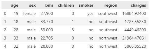
The following syntax is utilized to import the dataset.
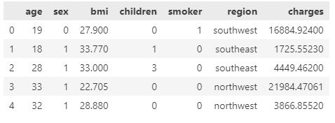
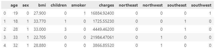
insurance_df=pd.read_csv("insurance.csv")
insurance_df.head()
Before analyzing the dataset, we must examine its characteristics and qualities for any missing, incorrect, or poorly formatted data.
We begin by identifying missing values in the dataset.
insurance_df.isnull().sum()

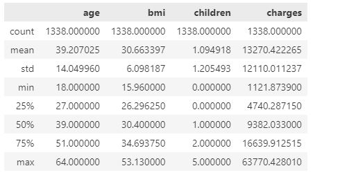
There are no missing values in the dataset. Then, we utilize .describe() function to obtain the statistical attributes of the dataset.
insurance_df.describe()
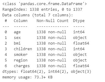
Following this, the data types of the characteristics are explored.
insurance_df.info()
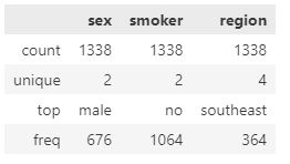
Similarly, we examine the object type attributes to decide if any of them might be considered categorical data. The following syntax can be used to output unique values and their frequency.
insurance_df.select_dtypes(include=['object']).describe()
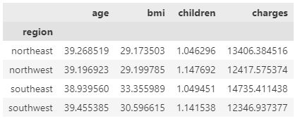
As demonstrated above, the sex and smoker attributes are categorical data, and the region feature can be converted to binary format. Next, we group the data according to the region attribute to get the average values of each attribute in each region.
df_region=insurance_df.groupby("region").mean()
df_region
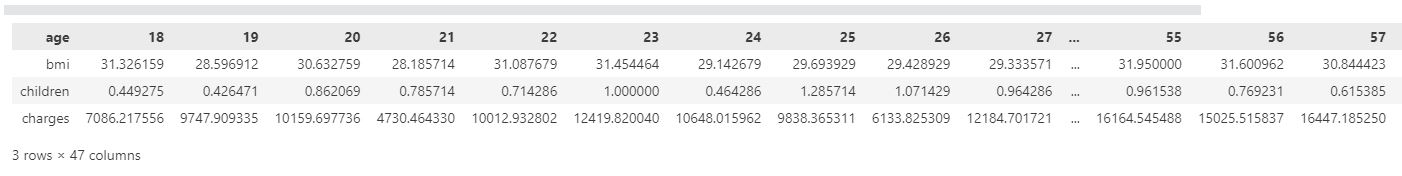
Finally, we group the data based on the age feature to determine the average BMI, children number, and insurance charge values for each age group.
df_age=insurance_df.groupby("age").mean()
df_age.T
A treemap represents hierarchical data as nested rectangles. Each group is represented by a proportionally sized rectangle. We will utilize the Plotly Express library to generate an interactive treemap for deeper data exploration.
To visualize the category shifts in the dataset, we constructed a treemap. We select region, sex, smoker, and age features as subcategories for the treemap. The feature of children is also included as hover information. The spectrum of colors represents a range of insurance costs.
config = {'displayModeBar': False}

insurance_cost_heatmap = px.treemap(
   insurance_df,
   path=[
   px.Constant('Insurane Cost in America by Region, Gender, Being a Smoker, and Age'), 'region', 'sex', 'smoker', 'age'],
   values='charges',color='charges', hover_data=['children'],
   color_continuous_scale='RdBu_r',
   color_continuous_midpoint=np.average(insurance_df['charges'], weights=insurance_df['children']))
insurance_cost_heatmap.update_layout(margin = dict(t=50, l=25, r=25, b=25))

insurance_cost_heatmap.show(config=config)
After examining the treemap, we will conduct a comprehensive analysis of the connections between a variety of features and the cost of insurance.
First, an interactive histogram will be used to illustrate the influence of smoking on insurance costs.
px.defaults.template = "plotly_white"

distribution_insurance_cost=px.histogram(insurance_df, x='charges', color='smoker', opacity=0.7, barmode='overlay',
					histnorm='probability density', marginal='box',
					title="Distribution of Insurance Costs by Smoking Status",
					color_discrete_sequence=['#B14B51','#B7A294'])
distribution_insurance_cost.update_layout(font_color="#303030", xaxis_title='Insurance Cost',
					yaxis=dict(title='Probability Density', gridcolor='#EAEAEA', zerolinecolor='#EAEAEA'),
					legend=dict(orientation="h", yanchor="bottom", y=1.02, xanchor="right", x=1, title=""))
distribution_insurance_cost.update_xaxes(showgrid=False, zerolinecolor='#EAEAEA')

distribution_insurance_cost.show()
Secondly, we will use an interactive box plot to show the quartiles, lowest, maximum, median, and outlier values for each age for the effect of age on insurance premiums.
px.defaults.template = "plotly_white"

cost_distribution_over_age = px.box(insurance_df, x="age", y="charges", color="sex",
             notched=True, points="outliers", height=600,
             title="Insurance Cost Distribution over Age Factor",
             color_discrete_sequence=['#B14B51', '#D0A99C', '#5D8370', '#6C839B'])
cost_distribution_over_age.update_traces(marker=dict(size=10,
							   opacity=0.5,
							   line=dict(width=3,color="#F7F7F7")),
							   showlegend=False)
cost_distribution_over_age.update_layout(font_color="#303030", xaxis_title='Age Factor', yaxis_title='Insurance Cost',
                  yaxis=dict(showgrid=True, gridwidth=1, gridcolor='#EAEAEA', zerolinecolor='#EAEAEA'))
cost_distribution_over_age.show()
Next, we will utilize the second interactive histogram to demonstrate the variance in insurance premiums between genders by comparing the shifts in quartiles, minimums, maximums, medians, and extremes.
distribution_cost_over_gender =px.histogram(insurance_df, x='charges', color='sex', opacity=0.7, barmode='overlay',
	histnorm='probability density', marginal='box',
	title="Distribution of Insurance Costs by Gender",
	color_discrete_sequence=['#B14B51','#B7A294'])
distribution_cost_over_gender.update_layout(font_color="#303030", xaxis_title='Insurance Cost',
	 yaxis=dict(title='Probability Density', gridcolor='#EAEAEA', zerolinecolor='#EAEAEA'),
	 legend=dict(orientation="h", yanchor="bottom", y=1.02, xanchor="right", x=1, title=""))
distribution_cost_over_gender.update_xaxes(showgrid=False, zerolinecolor='#EAEAEA')
distribution_cost_over_gender.show()
Afterwards, we will use another interactive histogram to show how much insurance costs vary across the region.
distribution_cost_region=px.histogram(insurance_df, x='charges', color='region', opacity=0.7, barmode='overlay',
	histnorm='probability density', marginal='box',
	title="Distribution of Insurance Costs by Regions",
	color_discrete_sequence=["#FFE7CC", "#9E726F", "#F8CBA6", "#D6B2B1"])
distribution_cost_region.update_layout(font_color="#303030", xaxis_title='Insurance Cost',
	 yaxis=dict(title='Probability Density', gridcolor='#EAEAEA', zerolinecolor='#EAEAEA'),
	 legend=dict(orientation="h", yanchor="bottom", y=1.02, xanchor="right", x=1, title=""))
distribution_cost_region.update_xaxes(showgrid=False, zerolinecolor='#EAEAEA')
distribution_cost_region.show()
The next step is to construct an interactive bar graph to compare insurance costs by age and gender to illustrate how they vary.
plot_df = insurance_df.copy()
plot_df["Age_Group"]=['18 to 29 years' if (i>=18)&(i<30)
			else '30 to 44 years' if (i>=30)&(i<45)
			else '45 to 59 years' if (i>=45)&(i<60)
			else '60 and over' for i in insurance_df['age']]

plot_df = plot_df.groupby(['Age_Group','sex'])['charges'].mean()
plot_df = plot_df.rename('charges').reset_index().sort_values('sex', ascending=True)
avergage_insurance_cost_gender = px.bar(plot_df, x='Age_Group', y='charges', color='sex', height=500, text='charges',
					    opacity=0.75, barmode='group', color_discrete_sequence=['#B7A294','#B14B51'],
					    title="Average Insurance Cost by Age and Gender")
avergage_insurance_cost_gender.update_traces(texttemplate='$%{text:,.0f}', textposition='outside',
						  marker_line=dict(width=1, color='#303030'))
avergage_insurance_cost_gender.update_layout(font_color="#303030",bargroupgap=0.05, bargap=0.3,
						  legend=dict(orientation="h",
						  		yanchor="bottom", y=1.02, xanchor="right", x=1, title=""),
						  xaxis=dict(title='Age Groups',showgrid=False),
						  yaxis=dict(title='Insurance Cost', showgrid=False,zerolinecolor='#DBDBDB',
						  showline=True, linecolor='#DBDBDB', linewidth=2))
avergage_insurance_cost_gender.show()
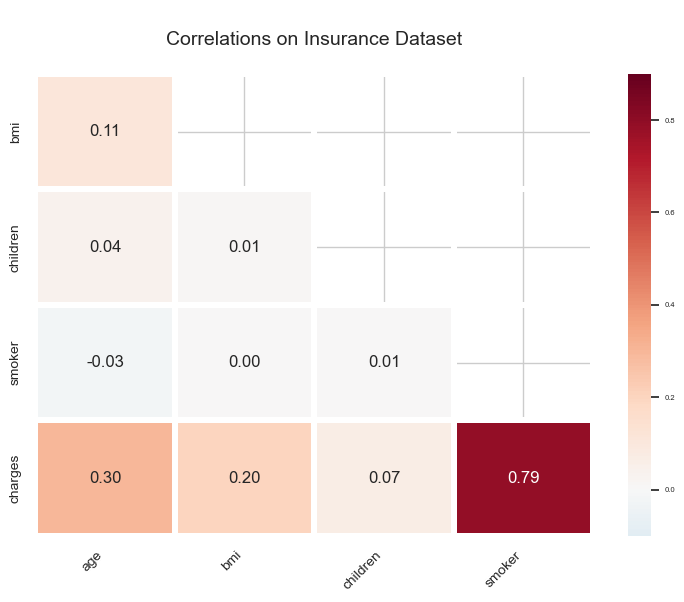
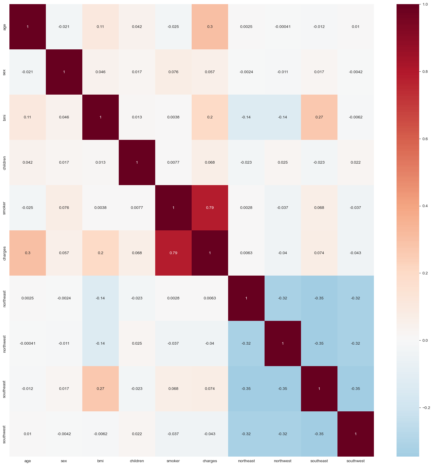
In the final step of the exploratory data analysis with visualization, a correlation graph will be created to display the correlation scores of each pair of attributes.
px.defaults.template = "plotly_white"

fig, ax = plt.subplots(figsize=(9,6))

corr=insurance_df.corr()

mask=np.triu(np.ones_like(corr, dtype=bool))[1:, :-1]
corr=corr.iloc[1:,:-1].copy()
ax=sns.heatmap(corr, mask=mask, vmin=-.1, vmax=.9, center=0, annot=True, fmt='.2f',
               cmap='RdBu_r', linewidths=4, annot_kws={"fontsize":12})
ax.set_title('\nCorrelations on Insurance Dataset\n', fontsize=14)
ax.set_xticklabels(ax.get_xticklabels(), rotation=45, horizontalalignment='right',fontsize=10)
ax.set_yticklabels(ax.get_yticklabels(), fontsize=10)
fig.show()
The following syntax will be used to convert the categorical attributes of the dataset to binary format.
insurance_df["sex"]=insurance_df["sex"].apply(lambda x:0 if x=="female" else 1)
insurance_df['smoker'] = insurance_df['smoker'].apply(lambda x: 0 if x == 'no' else 1)
insurance_df.head()
Then, we utilize pd.get dummies() function to transform the region feature's values to binary format using one-hot encoding.
region_dummies = pd.get_dummies(insurance_df['region'])
insurance_df = pd.concat([insurance_df, region_dummies], axis = 1)
insurance_df.drop(['region'], axis = 1, inplace = True)
insurance_df.head()
Before model selection, we plot an interactive pairplot to visualize the correlations between features after formatting the data. The transition from blue to red indicates the increasing age of policyholders.
features=insurance_df.columns
insurance_pairplot = px.scatter_matrix(insurance_df,
					   dimensions=features,
					   color="age",
					   color_continuous_scale='RdBu_r',
					   labels={col:col.replace('_', ' ') for col in insurance_df.columns}) # remove underscore
insurance_pairplot.update_layout(title='Scatter Matrix of Insurance Cost Data Set',
				    dragmode='select',
				    width=950,
				    height=1050,
				    hovermode='closest')
insurance_pairplot.update_traces(diagonal_visible=False)
insurance_pairplot.show()
We can use a correlation matrix to determine the specific scores for each pair of features.
sns.set_style("whitegrid")

corrmat= insurance_df.corr()
plt.figure(figsize=(20,20))
sns.heatmap(corrmat, annot=True, cmap="RdBu_r", center=0)
Next, we will define input features by omitting the charges column from the dataset and converting it into a 32-bit numpy array to expedite the computation.
X=insurance_df.drop(columns=["charges"])
X = np.array(X).astype('float32')
X.shape

Afterward, we define the charges column as the target dataset by converting it to a numpy array with a 32-bit format and utilizing .reshape() function to create a one-dimensional array for the training process.
y=insurance_df["charges"]
y = np.array(y).astype('float32')
y = y.reshape(-1,1)
y.shape

Now, we must normalize the dataset in order to prevent biases caused by continuous features.
scaler_x = StandardScaler()
X = scaler_x.fit_transform(X)

scaler_y = StandardScaler()
y = scaler_y.fit_transform(y)
Lastly, we will split the data sets into training and test datasets, with 20% of the datasets being randomly divided as the test datasets. We can see the final shapes of the dataset as follows:
X_train, X_test, y_train, y_test=train_test_split(X, y, test_size=0.2, random_state=10)
print("X_train: ", X_train.shape)
print("X_test: ", X_test.shape)
print("y_train: ", y_train.shape)
print("y_test: ", y_test.shape)

Our objective was to create a machine learning model capable of estimating medical insurance costs using the training dataset. To do this, the Ridge regression model will be utilized. This model is normally applied for highly correlated datasets; nonetheless, we will use it to demonstrate the methodology when we employ it with GridSearchCV to optimize the alpha value in order to attain the highest accuracy score on the training dataset. Alpha is a penalty or tuning parameter. We will generate a dictionary with several values as alpha parameters and use it as the GridSearchCV function's hyperparameter. In addition, we will set the CV parameter to 10 to generate 10 cross-validation folds. Finally, we will output the optimal parameter and alpha value for the Ridge Regression model.
ridge_model=Ridge()

parameters=[{"alpha":[0.001,0.1,1,1,10,100,1000,10000,100000,1000000,]}]

cv=10

ridge_cv=GridSearchCV(ridge_model, parameters, cv=cv)
ridge_cv.fit(X_train, y_train)

print("tuned hyperparameters :(best estimator) ", ridge_cv.best_estimator_)
print("tuned hyperparameters :(best parameters) ", ridge_cv.best_params_)
print("accuracy :", ridge_cv.best_score_)

The model's performance on the training dataset is approximately 76%, and we will examine its accuracy on test datasets. We begin by making predictions with out-of-sample data sets.
y_predict=ridge_cv.predict(X_test)
In order to compare the test target dataset and the predicted values to the actual scale, we utilize an inverse transformation including X test dataset.
y_predict_orig = scaler_y.inverse_transform(y_predict)
y_test_orig = scaler_y.inverse_transform(y_test)
x_test_orig = scaler_x.inverse_transform(X_test)
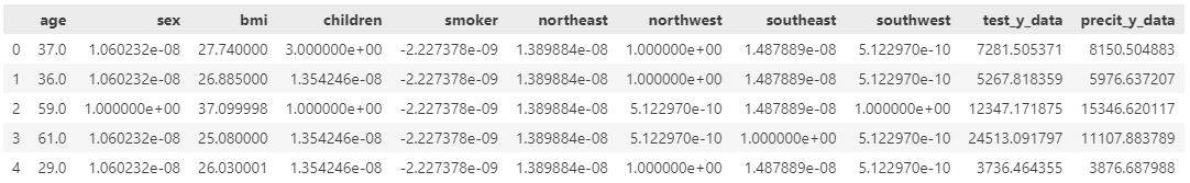
Afterward, we convert inversed datasets to Pandas dataframes and concatenate them into a single dataframe in order to generate regression diagrams for predicted and actual values.
test_y_data=pd.DataFrame(y_test_orig, columns=["test_y_data"])
predict_y_data=pd.DataFrame(y_predict_orig, columns=["precit_y_data"])
test_x_data=pd.DataFrame(x_test_orig, columns=['age', 'sex', 'bmi', 'children', 'smoker', 'northeast','northwest', 'southeast', 'southwest'])

plot_df = pd.concat([test_x_data, test_y_data, predict_y_data], axis=1)

plot_df.head()
To assess the degree of similarity between the predicted and actual values, we will generate an interactive regression plot.
model_scatterplot = px.scatter(plot_df,
				  x=plot_df["test_y_data"],
				  y=plot_df["precit_y_data"],
				  color="age", opacity=0.65,
				  color_continuous_scale='RdBu_r',
				  trendline='ols', trendline_color_override='darkred')

model_scatterplot.update_layout(title='Correlation of Actual and Predicted Insurance Cost',
				    xaxis_title='Actual Insurance Costs',
					yaxis_title='Predicted Insurance Costs')
model_scatterplot.update_xaxes(showgrid=True, zerolinecolor='#EAEAEA')
model_scatterplot.show()
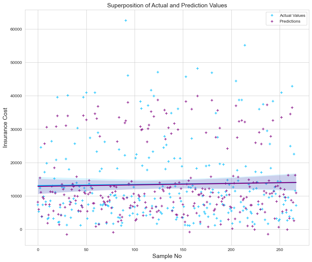
Next, we will utilize the regression plot in an unique approach to generate a superposition analysis of each sample and its expected fits. Hence, the graph will also depict the compatibility of the regression lines.
fig = plt.figure(figsize=(12, 10))
sns.regplot(x=pd.DataFrame([range(0,268)]), y=plot_df["test_y_data"], color='deepskyblue', marker='+', label="Actual Values")
sns.regplot(x=pd.DataFrame([range(0,268)]), y=plot_df["precit_y_data"], color="purple", marker='+', label="Predictions")

plt.title('Superposition of Actual and Prediction Values', size=14)
plt.xlabel('Sample No', size=14)
plt.ylabel('Insurance Cost', size=14)
plt.legend()
plt.show()
Finally, we calculate root mean squared error (RMSE), mean squared error (MSE), mean absolute error (MAE), and r-squared error (R2) as follows to determine the model 's performance on the test dataset.
k = X_test.shape[1]
n = len(X_test)

RMSE = float(format(np.sqrt(mean_squared_error(y_test_orig, y_predict_orig)),'.3f'))
MSE = mean_squared_error(y_test_orig, y_predict_orig)
MAE = mean_absolute_error(y_test_orig, y_predict_orig)
r2 = r2_score(y_test_orig, y_predict_orig)
adj_r2 = 1-(1-r2)*(n-1)/(n-k-1)

print('RMSE =',RMSE, '\nMSE =',MSE, '\nMAE =',MAE, '\nR2 =', r2, '\nAdjusted R2 =', adj_r2)
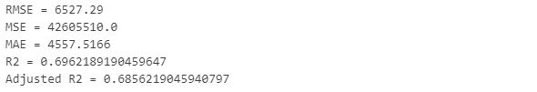
The results indicate that the model can accurately predict approximately 69% of the target values.