Customer Segmentation
via K-Means Clustering with KPCA
In the context of business, a clustering algorithm is a commercial strategy that facilitates customer segmentation, which is the classification of similar customers into the same segment. The clustering technique provides a more comprehensive understanding of clients, both in terms of their static demographics and their dynamic behaviors. Businesses can benefit from this strategy by building segment-specific marketing tactics. Clustering is the process of categorizing all of the data into groups (also known as clusters) based on patterns in the data, observing and changing the residual deviations of values.
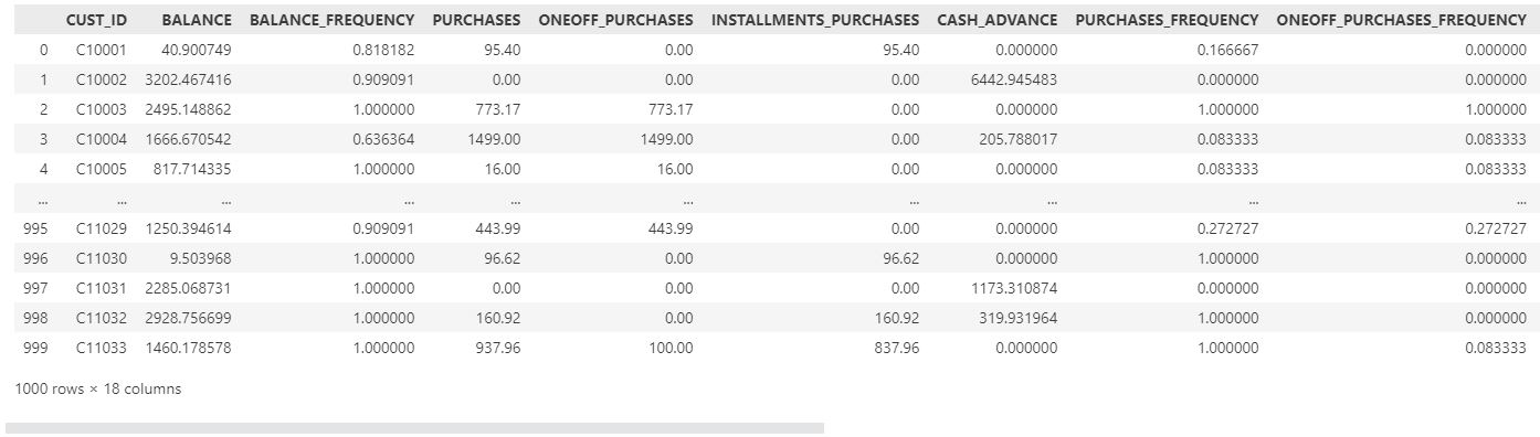
The dataset contains information on 9000 credit cardholders who actively used their cards over the course of six months; however, because to memory and processing constraints, we will only utilize the first 1000 records. Using an unsupervised learning strategy, we will examine these data to create consumer categories based on a shared attribute. Afterwards, we will be able to fine-tune our marketing efforts for each subgroup.
The datasetThis is a personal project completed as part of my portfolio. The dataset for the project was shared by Zohre Notash and is available on Kaggle.
The file contains following 18 behavioral characteristics at the customer level.
- CUST_ID: Credit card holder ID
- BALANCE: Monthly average balance (based on daily balance averages)
- BALANCE_FREQUENCY: Ratio of last 12 months with balance
- PURCHASES: Total purchase amount spent during last 12 months
- ONEOFF_PURCHASES: Total amount of one-off purchases
- INSTALLMENTS_PURCHASES: Total amount of installment purchases
- CASH_ADVANCE: Total cash-advance amount
- PURCHASES_ FREQUENCY: Frequency of purchases (Percent of months with at least one purchase)
- ONEOFF_PURCHASES_FREQUENCY: Frequency of one-off-purchases PURCHASES_INSTALLMENTS_FREQUENCY: Frequency of installment purchases
- CASH_ADVANCE_ FREQUENCY: Cash-Advance frequency
- AVERAGE_PURCHASE_TRX: Average amount per purchase transaction
- CASH_ADVANCE_TRX: Average amount per cash-advance transaction
- PURCHASES_TRX: Average amount per purchase transaction
- PAYMENTS: Total payments (due amount paid by the customer to decrease their statement balance) in the period
- MINIMUM_PAYMENTS: Total minimum payments due in the period.
- PRC_FULL_PAYMENT: Percentage of months with full payment of the due statement balance
- TENURE: Number of months as a customer
For data manipulation and feature engineering, we will utilize Pandas and Numpy. We need to import the Matplotlib and Seaborn libraries for data visualization and exploratory analysis. Finally, segmentation algorithms will be implemented using Scikit-Learn (Sklearn) library modules.
For this project to get started, the following Python libraries are imported.
import pandas as pd
import numpy as np

import matplotlib
import matplotlib.pyplot as plt
from matplotlib import colors
import seaborn as sns
from mpl_toolkits.mplot3d import Axes3D

from sklearn.preprocessing import StandardScaler
from sklearn.decomposition import KernelPCA
from sklearn.cluster import KMeans

from sklearn.metrics import silhouette_samples, silhouette_score

from yellowbrick.cluster import KElbowVisualizer
The following syntax is utilized to import the dataset.
data=pd.read_csv("Customer Dataset.csv")
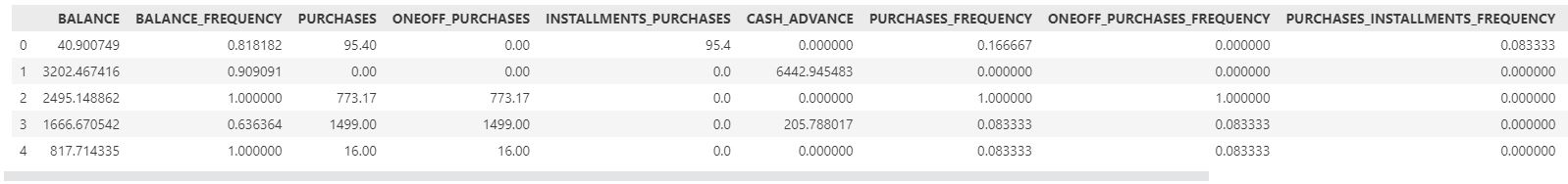
df=data.head(1000)
df
Before examining the dataset, we must first analyze its features and attributes for any missing, inaccurate, or incorrectly formatted data.
There are three unlabeled columns in the dataset, and since we do not know their function, we must remove them. Afterward, we need to use .isnull() method to figure out whether any attributes are missing.
df.isnull().sum()
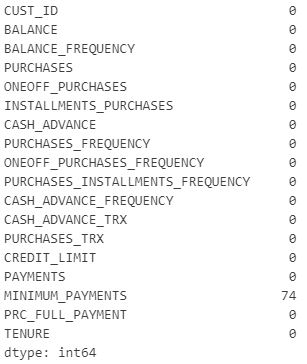
There are 74 missing values in the "MINIMUM PAYMENTS" column. The median of the corresponding attribute should be used to fill these values.
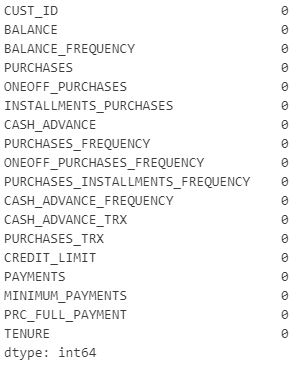
df["MINIMUM_PAYMENTS"]=df["MINIMUM_PAYMENTS"].fillna(df["MINIMUM_PAYMENTS"].median())
df.isnull().sum()
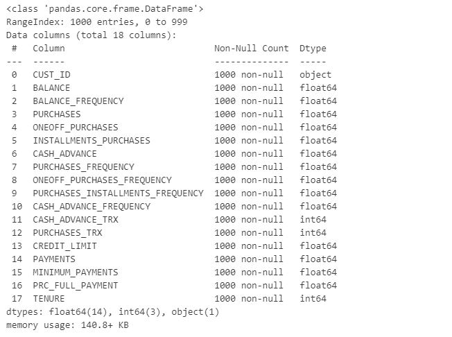
Following that, we will look into the data types that the attributes have.
df.info()
The "CUST ID" column contains the identification numbers of credit card owners. This characteristic is unrelated to a customer's behavioral characteristics.
df.drop(["CUST_ID"], axis=1, inplace=True)
df.head()
KPI is an abbreviation for "key performance indicator." This is a method for measuring the achievement of a goal over time. Four KPIs will be calculated for each cardholder.
After clustering data, we can utilize these four KPIs to group it, which helps us develop a marketing strategy.
df['Monthly_avg_purchase']=df['PURCHASES']/df['TENURE']
df['Monthly_cash_advance']=df['CASH_ADVANCE']/df['TENURE']
df['limit_usage']=df.apply(lambda x: x['BALANCE']/x['CREDIT_LIMIT'], axis=1)
df['payment_minpay']=df.apply(lambda x:x['PAYMENTS']/x['MINIMUM_PAYMENTS'],axis=1)
According to the data set, there are four distinct forms of purchase behavior; therefore, we must generate a categorical variable based on these behaviors.
def purchase(df):
    if (df['ONEOFF_PURCHASES']==0) & (df['INSTALLMENTS_PURCHASES']==0):
        return 'none'
    if (df['ONEOFF_PURCHASES']>0) & (df['INSTALLMENTS_PURCHASES']>0):
         return 'both_oneoff_installment'
    if (df['ONEOFF_PURCHASES']>0) & (df['INSTALLMENTS_PURCHASES']==0):
        return 'one_off'
    if (df['ONEOFF_PURCHASES']==0) & (df['INSTALLMENTS_PURCHASES']>0):
        return 'installment'

df['purchase_type']=df.apply(purchase,axis=1)
df.head()

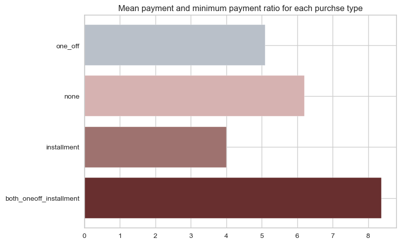
By utilizing .groupby() function, we can visualize the distribution of individuals purchase behavior. The ratio of mean payments to minimum payments over purchasing behavior will be shown.
x=df.groupby('purchase_type').apply(lambda x: np.mean(x['payment_minpay']))

fig,ax=plt.subplots()
ax.barh(y=range(len(x)), width=x.values, align='center', color=("#682F2F", "#9E726F", "#D6B2B1", "#B9C0C9", "#9F8A78", "#F3AB60", "#CFBA5F"))
ax.set(yticks= np.arange(len(x)),yticklabels = x.index);
plt.title('Mean payment_minpayment ratio for each purchse type')
We will use the pd.get dummies() function to convert the "purchase type" column into binary format so that we can apply clustering algorithms, and then we will remove the "purchase type" column.
df=pd.concat([df,pd.get_dummies(df['purchase_type'])],axis=1)
df=df.drop(['purchase_type'],axis=1)
Using pairplot to generate correlation plots for each pair of columns in a dataset is the most practical method for studying correlations within a dataset, and we may identify outliers for removal.
sns.set_style("whitegrid")

pallet = ["#682F2F", "#9E726F", "#D6B2B1", "#B9C0C9", "#9F8A78", "#F3AB60", "#CFBA5F"]

plt.figure()
sns.pairplot(df, hue="TENURE", palette=pallet)

plt.show()
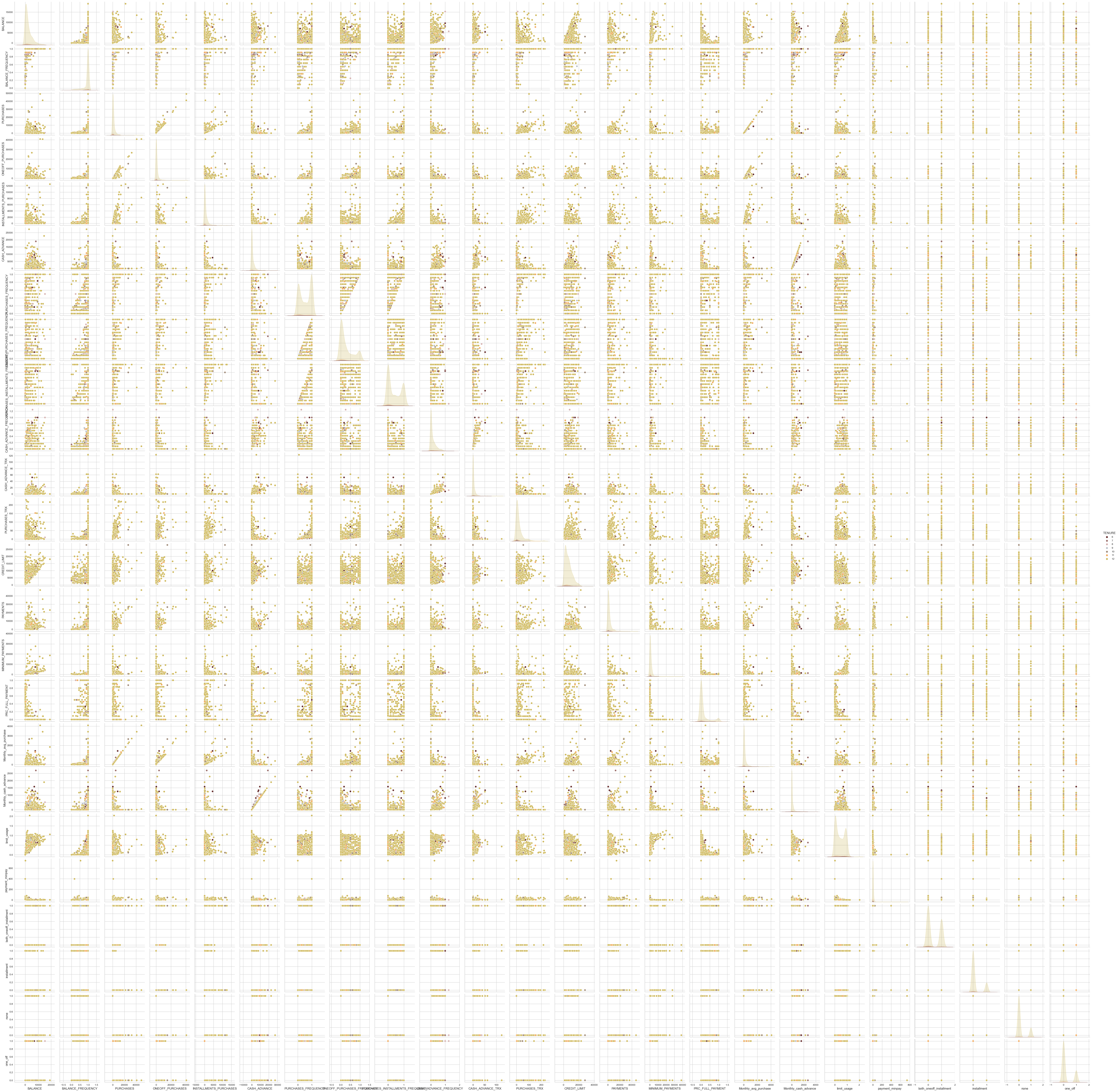
After examining the pairplot, we identify various limits and outliers that should be eliminated from the dataset in order to improve data quality and segmentation.
length=len(df)
df = df[(df['CASH_ADVANCE_TRX']<120)]
df = df[(df['PURCHASES']<40000)]
df = df[(df['ONEOFF_PURCHASES']<40000)]
df = df[(df['INSTALLMENTS_PURCHASES']<12000)]
df = df[(df['CASH_ADVANCE']<20000)]
df = df[(df['MINIMUM_PAYMENTS']<30000)]

print("The number of data-points removed the outliers is:", (length-len(df)))

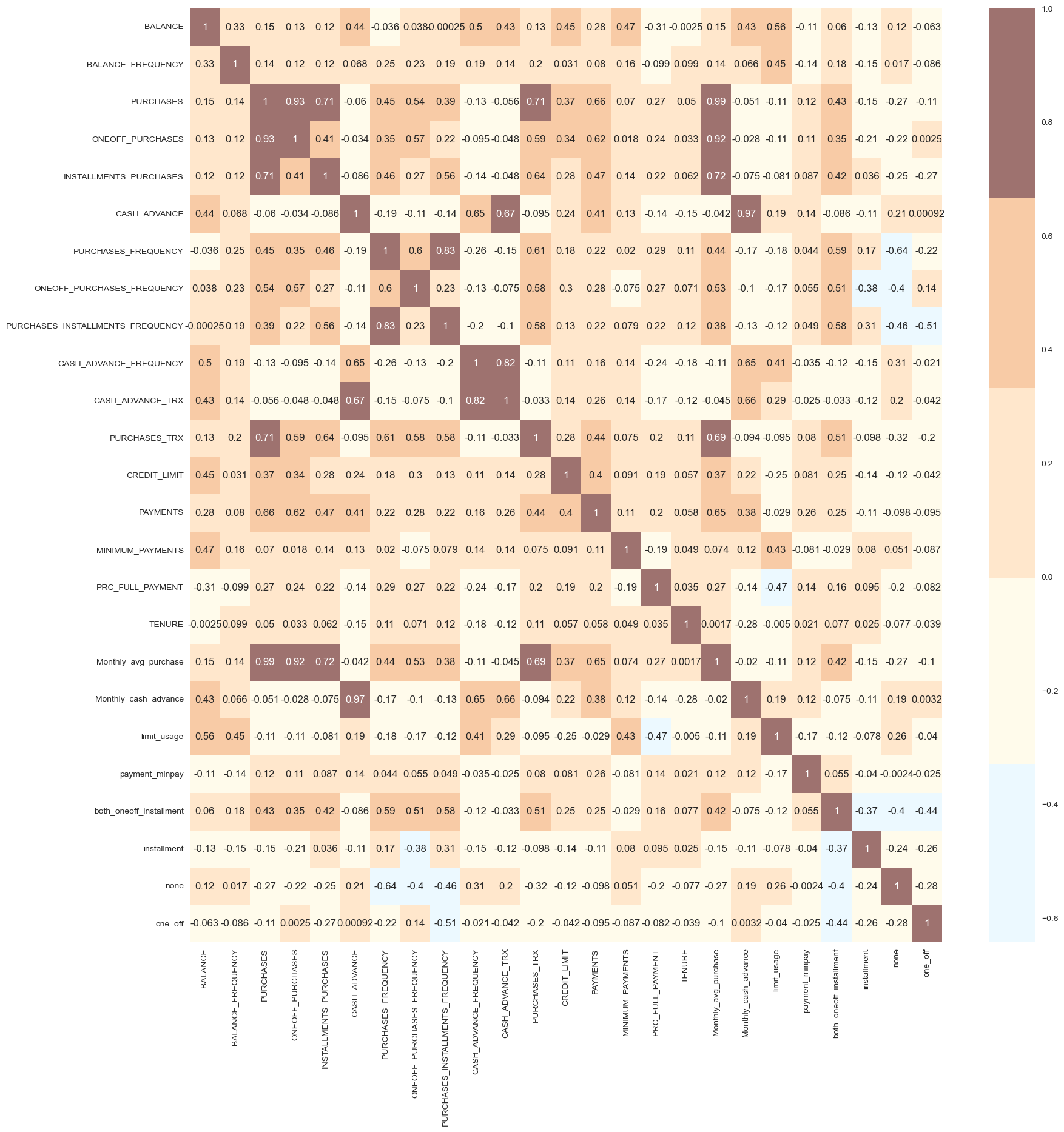
To figure out the correlation between each attribute, we then plot a correlation matrix.
#correlation matrix
sns.set_style("whitegrid")

cmap = colors.ListedColormap(["#D6B2B1", "#ECF9FF", "#FFFBEB", "#FFE7CC", "#F8CBA6", "#9E726F"])

corrmat= df.corr()
plt.figure(figsize=(20,20))
sns.heatmap(corrmat, annot=True, cmap=cmap, center=0)
The visualization phase of exploratory analysis has completed. Before performing feature engineering, we have enough data to finalize the dataset for training the K-Means algorithm.
Feature EngineeringNext, we will convert the attributes of the dataset into numpy format with the data type float32, as the default data type of numpy arrays is float64, in order to half memory usage and double processing speed.
data = df.to_numpy().astype('float32')
The attributes of a dataframe need to be standardized such that each feature has an equal impact on the predictions before they can be used.
scaler=StandardScaler()
scaled_data=scaler.fit_transform(data)
scaled_data[:, 0].std()
The final classification in this problem depends on a wide variety of criteria.The more complex a system is, the more difficult it is to manage its features. Some of these characteristics overlap with one another. Because of this, we will first apply dimensionality reduction to the chosen features before feeding them into a classifier. The goal of dimensionality reduction is to narrow down a large set of potential variables into a manageable subset called principal variables. Non-linear dimensionality reduction is achieved by use of kernel principal component analysis (KPCA). It's a non-linear dimensionality reduction methodology that builds on principal component analysis (PCA) by employing kernel methods. The dimensions for this project will be reduced to 3.
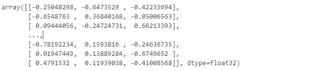
kpca=KernelPCA(n_components=3, kernel="cosine")
res_kpca_cos=kpca.fit_transform(scaled_data)
res_kpca_cos
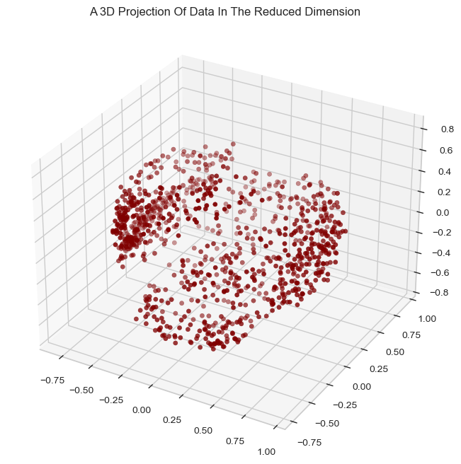
We will present a 3D data projection with a reduced dimension.
x = res_kpca_cos[:, 0]
y = res_kpca_cos[:, 1]
z = res_kpca_cos[:, 2]

sns.set_style("whitegrid")
fig = plt.figure(figsize=(10,8))
ax = fig.add_subplot(111, projection="3d")
ax.scatter(x,y,z, c="maroon", marker="o" )
ax.set_title("A 3D Projection Of Data In The Reduced Dimension")
plt.show()
After all the attributes have been reduced to three dimensions, the K-Means clustering algorithm will be used to conduct clustering. To identify the number of clusters to be generated, the elbow method is going to be used first.
Elbow_M = KElbowVisualizer(KMeans(), k=10)
Elbow_M.fit(kpca_df)
Elbow_M.show()
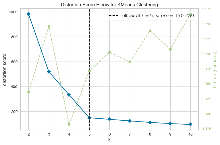
The graph demonstrates that the optimal number of clusters for these data is five. Next, the the K-Means model will be fitted to obtain the final clusters.
clusterer=KMeans(n_clusters=5, random_state=123)
clusters=clusterer.fit_predict(kpca_df)

kpca_df["Clusters"] = clusters
df["Clusters"]= clusters
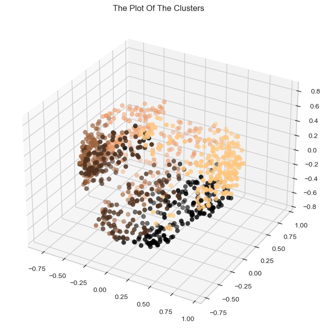
Let's have a look at the 3-D distribution of the clusters in order to evaluate the clusters that have generated.
sns.set_style("whitegrid")

fig = plt.figure(figsize=(10,8))
ax = plt.subplot(111, projection='3d', label="bla")
ax.scatter(x, y, z, s=40, c=kpca_df["Clusters"], cmap="copper", marker='o' )
ax.set_title("The Plot Of The Clusters")
plt.show()
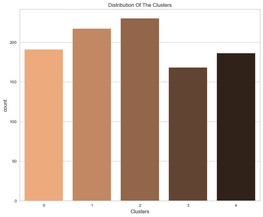
Given that this is unsupervised clustering. Our model lacks a tag function for evaluation and scoring. This section's objective is to determine the nature of the clusters' patterns by analyzing their formation patterns. For this purpose, exploratory data analysis will be utilized to examine the data in light of clusters and draw inferences. Initially, let's have a look at the cluster group distribution.
sns.set_style("whitegrid")

fig = plt.figure(figsize=(10,8))
pl = sns.countplot(x=df["Clusters"], palette= "copper_r")
pl.set_title("Distribution Of The Clusters")
plt.show()
Then, we can use the .tansform.inverse_transform() function to reverse the scaling of the test and prediction values in order to compare their real values.
sns.set_style("whitegrid")
fig = plt.figure(figsize=(10,8))
pl=sns.boxenplot(x=df["Clusters"], y=df["BALANCE"], palette="copper_r")
plt.show()
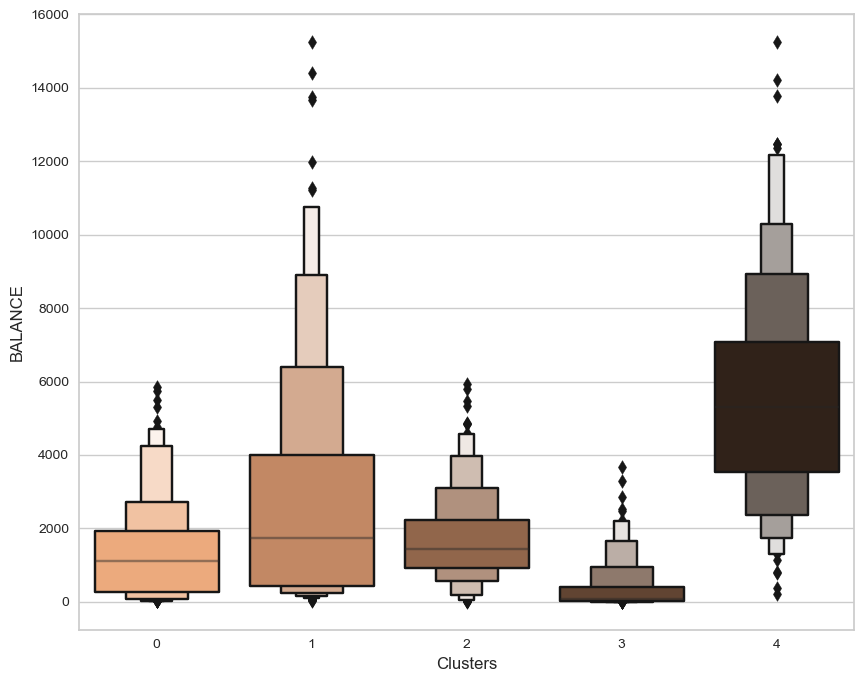
From the plots, it is evident that cluster 4 has the highest client potential, closely followed by cluster 1. Even though cluster 4 has the least number of customers after cluster 3, it has the greatest balance distribution. Cluster 2's client has the most members, but the second-lowest balance after Cluster 3.
The silhouette coefficient, often known as the silhouette score, is a statistic used to determine the performance of a clustering algorithm. The best possible value is 1, while the worst possible value is -1. Cluster overlap is indicated by values close to 0. Negative values typically suggest that a sample has been incorrectly assigned to a cluster because another cluster is more comparable. As the silhouette score approaches 1, we can conclude that our clusters are separated by a significant distance with a silhouette score of 0.635.
silhouette_score_average = silhouette_score(kpca_df, clusters, metric = 'euclidean')
print("Average Silhouette Score", silhouette_score_average)
