IBM Capstone Project
SpaceX - Exploratory Data Analysis with Visualization
This is the capstone project required to get the IBM Data Science Professional Certificate. Yan Luo, a data scientist and developer, and Joseph Santarcangelo, both data scientists at IBM, directed the project. The project will be presented in seven sections, and the lecture Jupyter notebooks and tutorials were used to compile the contents.
As a data scientist, I was tasked with forecasting if the first stage of the SpaceX Falcon 9 rocket will land successfully, so that a rival firm might submit better informed bids for a rocket launch against SpaceX. On its website, SpaceX promotes Falcon 9 rocket launches for 62 million dollars, whereas other companies charge upwards of 165 million dollars. A significant portion of the savings is attributable to SpaceX's ability to reuse the first stage. If we can determine whether the first stage will land, we can calculate the launch cost. This information might be useful if an alternative company want to compete with SpaceX for a rocket launch. In this project, I will conduct data science methodology including business understanding, data collection, data wrangling, exploratory data analysis, data visualization, model development, model evaluation, and stakeholder reporting.
In the fifth phase of the project, we will use Pandas and Matplotlib to do exploratory Data Analysis and Feature Engineering. The numpy, pandas, and seaborn libraries are to be imported. Seaborn is a Python library for data visualization based on matplotlib. It provides a sophisticated interface for creating visually appealing and useful statistical graphs. Firstly, we need to install the packages.
!pip install numpy
!pip install pandas
!pip install seaborn
We then import them in order to begin data analysis and feature engineering.
import pandas as pd
import numpy as np
import matplotlib.pyplot as plt
import seaborn as sns
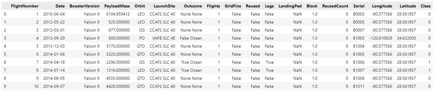
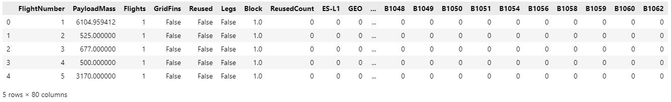
Let's begin by importing the SpaceX dataset into a Pandas dataframe and printing its summary.
URL = "https://cf-courses-data.s3.us.cloud-object-storage.appdomain.cloud/IBM-DS0321EN-SkillsNetwork/datasets/dataset_part_2.csv"
resp = pd.read_csv(URL)
df =pd.DataFrame(resp)
df.head(10)
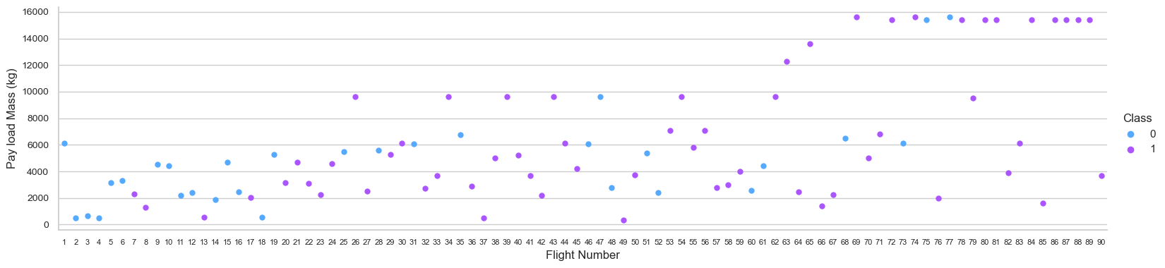
In the first analysis, we will attempt to determine how the variables 'FlightNumber' (which indicates the number of launch attempts) and 'Payload' affect the launch outcome. We can plot FlightNumber versus PayloadMass and overlay the launch's outcome.
sns.set_style("whitegrid")
sns.catplot(data=df, x="FlightNumber", y="PayloadMass", hue="Class", palette="cool", size=6, height=4, aspect=4)
plt.xlabel("Flight Number",fontsize=12, loc="center")
plt.ylabel("Pay load Mass (kg)",fontsize=12, loc="center")
plt.xticks(fontsize=8)
plt.yticks(fontsize=10)
plt.show()
When the number of flights increases, the probability that the initial stage will land successfully increases. The mass of the payload is also significant; it appears that the greater the mass of the payload, the less probable the first stage will return.
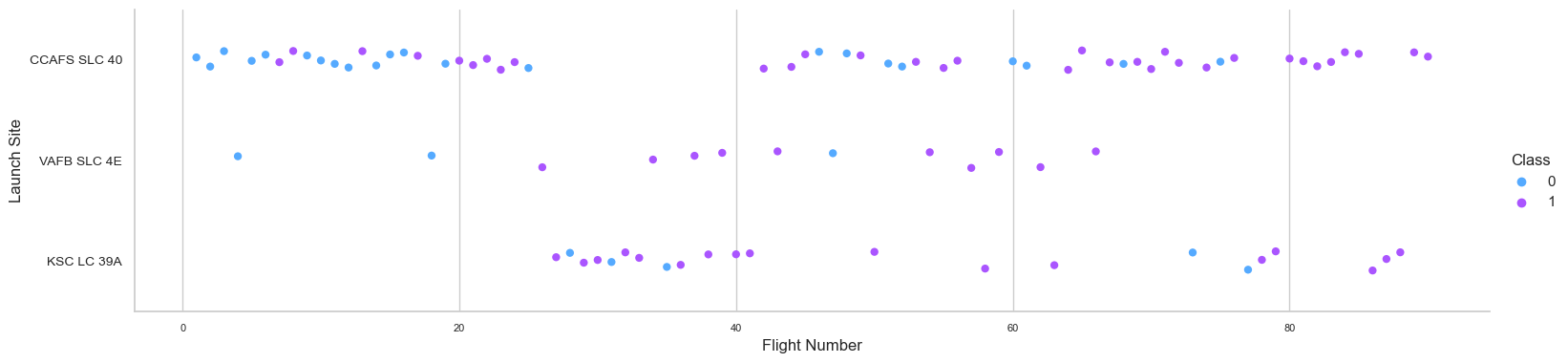
Next, we examine each site's launch records in detail. To plot FlightNumber versus LaunchSite using the function catplot, set the x parameter to FlightNumber, the y parameter to Launch Site, and the hue parameter to 'class'.
sns.set_style("whitegrid")
sns.catplot(data=df, x="FlightNumber", y="LaunchSite", hue="Class", palette="cool", size=6, height=4, aspect=4)
plt.xlabel("Flight Number", fontsize=12, loc="center")
plt.ylabel("Launch Site", fontsize=12, loc="center")
plt.xticks(fontsize=8)
plt.yticks(fontsize=10)
plt.show()
The most recent successes have all occurred at CCAF5 SLC 40, making it the optimal launch point over the time. The second successful launch location is VAFB SLC 4E, followed by KSC LC 39A. Moreover, it is feasible to see a rise in success rate over time.
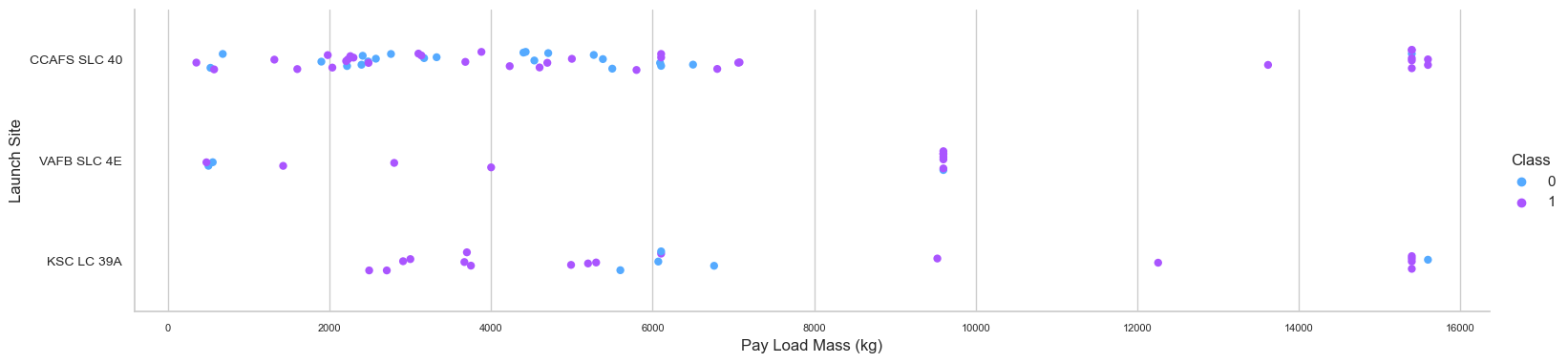
Then, we will attempt to explain the patterns revealed in the Flight Number versus Launch Site scatter plots. We aim to determine whether there is a correlation between launch sites and payload mass.
sns.set_style("whitegrid")
sns.catplot(data=df, x="PayloadMass", y="LaunchSite", hue="Class", palette="cool", size=6, height=4, aspect=4)
plt.xlabel("Pay Load Mass (kg)", fontsize=12, loc="center")
plt.ylabel("Launch Site", fontsize=12, loc="center")
plt.xticks(fontsize=8)
plt.yticks(fontsize=10)
plt.show()
The success rate for payloads exceeding 9,000kg is outstanding; payloads over 12,000kg are possible only at the CCAFS SLC 40 and KSC LC 39A launch sites. This scatter plot demonstrates that after the payload mass exceeds 7,000 kg, the success rate probability will climb dramatically. Yet, there is no conclusive evidence that the launch site's success percentage is dependent on the payload's mass.
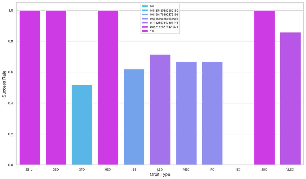
Next, we will visually determine whether or not there is a correlation between success rate and orbit type. For each orbit's success rate, we shall produce a bar chart.
sns.set(style="whitegrid")

suc_rate = df.groupby(by=['Orbit']).Class.mean().reset_index()

plt.figure(figsize = (14, 8))
sns.barplot(data=suc_rate, x="Orbit", y="Class", hue="Class", palette="cool", dodge=False)
plt.xlabel("Orbit Type", fontsize=12, loc="center")
plt.ylabel("Success Rate", fontsize=12, loc="center")
plt.legend(loc="upper center", frameon=True, fontsize=8)
plt.xticks(fontsize=8)
plt.yticks(fontsize=10)
plt.show()
SSO, HEO, GEO, and ES-L1 orbits all resulted in a success rate of one hundred percent, whereas SO orbit resulted in a failure rate of one hundred percent. The bar chart depicted the potential for orbits to influence landing results. However, a deeper examination finds that certain orbits, such as GEO, SO, HEO, and ES-L1, have only one occurrence, indicating that this data need additional datasets to identify patterns or trends before we can draw conclusions.
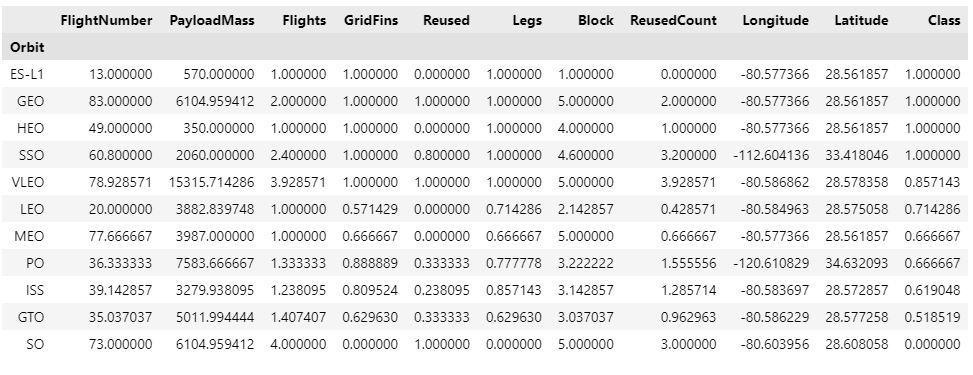
We can also print the orbits with the highest success rate using Pandas functions. We can group the dataframe by the Orbit column, calculate the mean for each group, and then sort the result by Class column in descending order.
df.groupby(['Orbit']).mean().head(12).sort_values(['Class'],ascending=False)
For each orbit, we wish to determine whether FlightNumber and Orbit type are correlated.
sns.set(style="whitegrid")

suc_rate = df.groupby(by=['Orbit']).Class.mean().reset_index()

plt.figure(figsize = (14, 8))
sns.barplot(data=suc_rate, x="Orbit", y="Class", hue="Class", palette="cool", dodge=False)
plt.xlabel("Orbit Type", fontsize=12, loc="center")
plt.ylabel("Success Rate", fontsize=12, loc="center")
plt.legend(loc="upper center", frameon=True, fontsize=8)
plt.xticks(fontsize=8)
plt.yticks(fontsize=10)
plt.show()
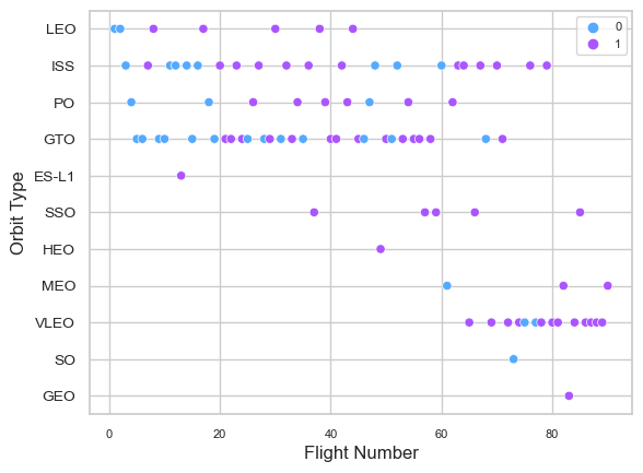
The scatter plot reveals that, with the exception of the GTO orbit, the more the flight number on each orbit, the higher the success rate (particularly on the LEO orbit). Orbits with a single occurrence should likewise be excluded from the preceding statement, as it requires further information. Apparently, success rates for all orbits have increased over time; the VLEO orbit represents a new economic possibility because its frequency has just increased.
Payload Mass(kg) vs. Orbit TypePayload vs. Orbit scatter plots can be generated to demonstrate how different orbit types interact with various payload sizes.
sns.set_style("whitegrid")
sns.scatterplot(data=df, y="Orbit", x="PayloadMass", hue="Class", palette="cool", sizes=(4,8))
plt.xlabel("Pay Load Mass (kg)", fontsize=12, loc="center")
plt.ylabel("Orbit Type", fontsize=12, loc="center")
plt.xticks(fontsize=8)
plt.yticks(fontsize=10)
plt.legend(loc="best", frameon=True, fontsize=8)
plt.show()
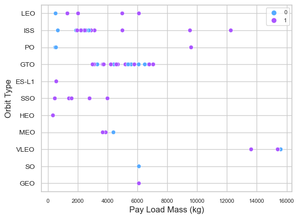
LEO, ISS, and P0 orbits all benefit from bigger payloads. The impact is negative for MEO and VLEO orbits. There appears to be no correlation between the GTO orbit's depicted properties. Moreover, additional information is necessary for SO, GEO, and HEO orbits to discover trends or patterns. It is essential to remember that heavier payloads may have a negative impact on GTO orbits but a positive impact on ISS and LEO orbits.
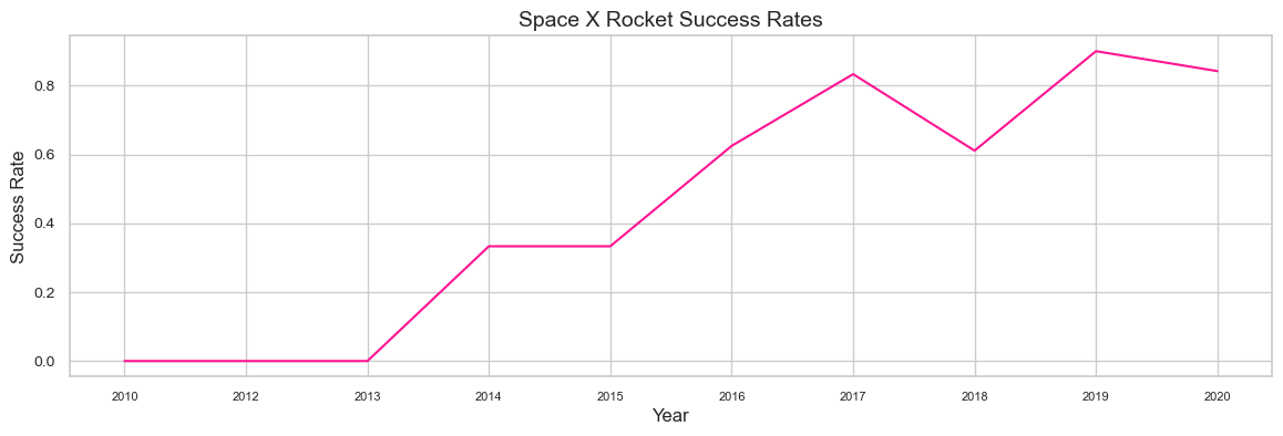
SpaceX Rocket's Success Trend in YearsTo better understand the general trajectory of launch success, we aim to create a new line chart in which Year replaces the x axis and the y axis represents the average success rate. Firstly, we define a function that returns the years and mean of the Class column for the corresponding year as the success rate of the year.
year=[]
def Extract_year():
	for i in df["Date"]:
		year.append(i.split("-")[0])
	return year
Extract_year()
df['Date'] = year
df.head()
df_groupby_year=df.groupby(year and df["Date"],as_index=False).Class.mean()
df_groupby_year
Then, we generate a line graph with the extracted year along the x-axis and the success rate along the y-axis.
df_groupby_year=df.groupby(year and df["Date"],as_index=False).Class.mean()

sns.set_style("whitegrid")

plt.figure(figsize = (14, 4))
sns.lineplot(data=df_groupby_year, x=df_groupby_year["Date"], y=df_groupby_year["Class"], color="deeppink", linewidth=1.5)
plt.xlabel("Year",fontsize=12)
plt.title('Space X Rocket Success Rates', fontsize=14, loc="center")
plt.ylabel("Success Rate",fontsize=12, loc="center")
plt.xticks(fontsize=8)
plt.yticks(fontsize=10)
plt.show()
From 2013 through 2020, the line chart clearly illustrates a growing tendency. If this pattern continues over the following year and beyond, the success rate will eventually rise to 100%. The success rate began to rise in 2013 and continued to rise until 2020. It appears that the first three years were a time of technological adjustment and development.
Feature Engineering
At this point, we should have a good idea of how each critical factor influences the success rate, allowing us to pick the features that will be used in success prediction in the next phase.
features = df[['FlightNumber', 'PayloadMass', 'Orbit', 'LaunchSite', 'Flights', 'GridFins', 'Reused', 'Legs', 'LandingPad', 'Block', 'ReusedCount', 'Serial']]

features.head()
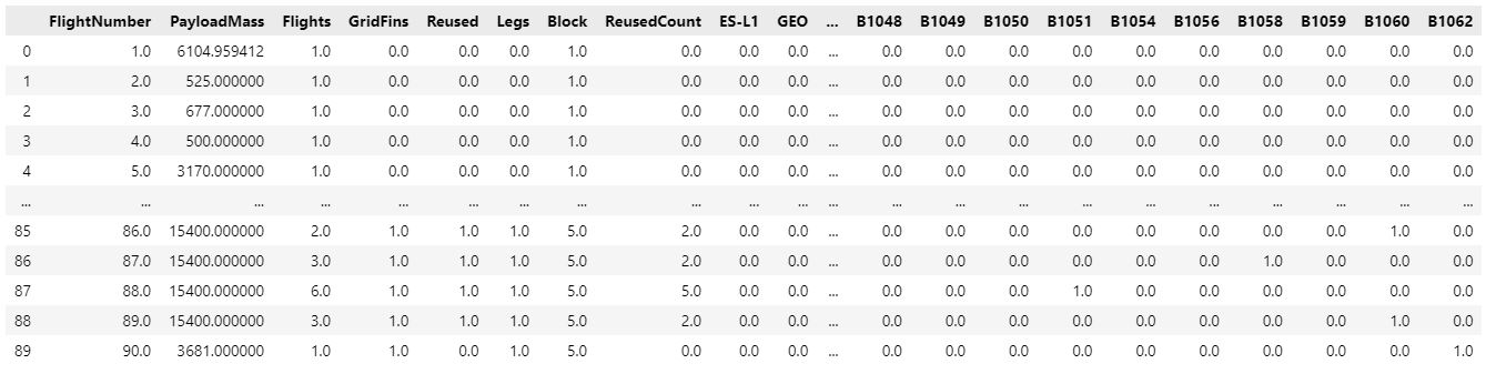
To improve the accuracy of predictions made by machine learning algorithms, one-hot encoding transforms categorical data into a form that can be fed into those models. When working with categorical data, one-hot encoding is frequently used in machine learning. Orbits, LaunchSite, LandingPad, and Serial can be encoded using OneHotEncoder by means of the get_dummies() function and features of dataframe. We store the value in features_one_hot, then use the head method to display the data.
features_one_hot = features
""
features_one_hot = pd.concat([features_one_hot,pd.get_dummies(df['Orbit'])],axis=1)
features_one_hot.drop(['Orbit'], axis = 1, inplace = True)

features_one_hot = pd.concat([features_one_hot,pd.get_dummies(df['LaunchSite'])],axis=1)
features_one_hot.drop(['LaunchSite'], axis = 1, inplace = True)

features_one_hot = pd.concat([features_one_hot,pd.get_dummies(df['LandingPad'])],axis=1)
features_one_hot.drop(['LandingPad'], axis = 1, inplace = True)

features_one_hot = pd.concat([features_one_hot,pd.get_dummies(df['Serial'])],axis=1)
features_one_hot.drop(['Serial'], axis = 1, inplace = True)

features_one_hot.head()
Finally, since our features one hot dataframe includes numeric elements, we must convert all of the numeric variables to float64 type.
features_one_hot = features_one_hot.astype(float)
features_one_hot
For the following step, we can now export the final dataframe as a CSV file.
features_one_hot.to_csv('dataset_part_3.csv', index=False)