CO2 Emission Prediction
for Vehicles via ANN
This is a personal project completed as part of my portfolio. The dataset for the project was shared by Pratham Tripathi and is available on Kaggle.
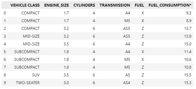
The dataset contains diverse information regarding a group of vehicles that were manufactured with a set of factory parameters, including engine size, cylinder number, transmission type, fuel type, fuel consumption, and amount of carbon dioxide emissions. The objective of the project is to train a neural network with correlated features to predict CO2 emissions as the target variable for out-of-sample data.
Tensorflow (Google's machine learning framework) and Keras (the API for Tensorflow) will be employed for this project. The dense, activation, dropout, and batch normalization modules, as well as the ADAM module as the optimizer, must be imported for the ANN's layers. We must import Pandas and Numpy for data manipulation and feature engineering. For data visualization and exploratory analysis, we need to import the Matplotlib and Seaborn libraries. Lastly, we should import modules from the Scikit-Learn (Sklearn) library to standardize and split our data and to analyze the performance of ANNs using machine learning performance metrics.
The following Python libraries are initially imported for this project.
import pandas as pd
import numpy as np

import matplotlib.pyplot as plt
import seaborn as sns

import tensorflow as tf
from tensorflow import keras
from tensorflow.keras.layers import Dense, Activation, Dropout, BatchNormalization
from tensorflow.keras.optimizers import Adam

from sklearn import preprocessing
from sklearn.preprocessing import StandardScaler

from sklearn.model_selection import train_test_split

from sklearn.metrics import r2_score, mean_squared_error, mean_absolute_error
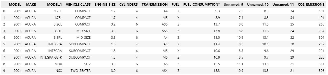
The following syntax is utilized to import the dataset.
df=pd.read_csv("car_carbon_emission.csv")
df.head(10)
After importing the dataset, we must examine its features and attributes for any missing, incorrect, or improperly formatted data before analyzing it.
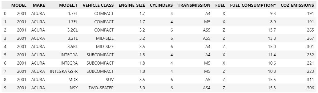
There are three unlabeled columns in the dataset, and since we do not know their function, we must remove them.
df.drop(df.columns[[9, 10, 11]], axis=1, inplace=True)
df.head(10)
Secondly, we must determine if any attribute values for features are missing.
df.isnull().sum()
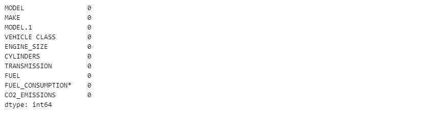
In the data set, there are no missing values. Using the following syntax, we will now examine the data types of features.
df.dtypes
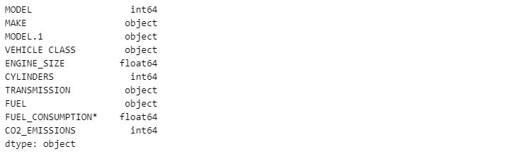
Before conducting analysis, we should additionally examine the dataset's description to ensure that there are no anomalies.
df.describe()
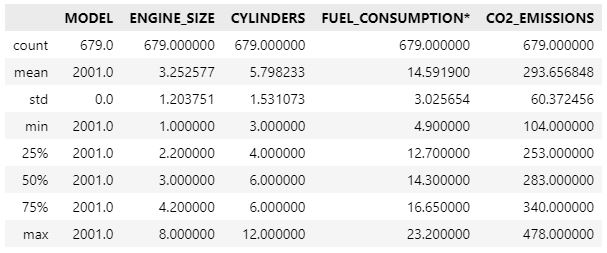
After a number of steps, the first assumption we made was that there are five features with attributes in the object data type, and we must eliminate the "MAKE" and "MODEL.1" columns because they relate to the manufacturer and model name of their vehicles, and these features are irrelevant with the target variable. In addition, we must drop the "MODEL" column because it contains a single number, 2011, and is therefore useless given that all vehicles were manufactured in 2011.
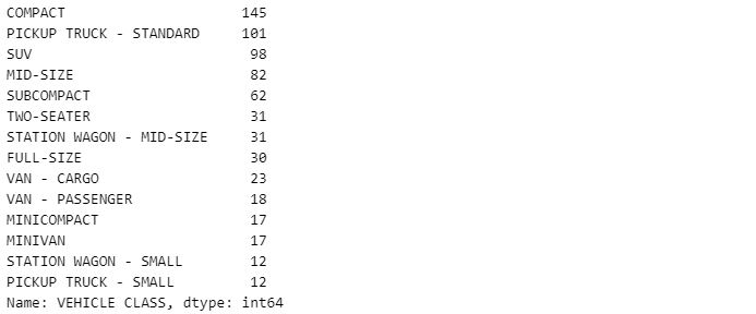
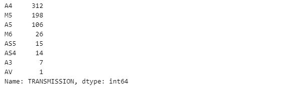
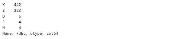
Next, we must identify the unique value types in the "VEHICLE CLASS," "TRANSMISSION," and "FUEL" columns in order to determine if they are suitable for one-hot encoding.
df["VEHICLE CLASS"].value_counts()
df["TRANSMISSION"].value_counts()
df["FUEL"].value_counts()
We have ended the data manipulation step and must now investigate the correlations between features and the target variable in order to select the final features for training the ANN algorithm.
Exploratory Data Analysis with VisualizationUsing pairplot to generate correlation plots for each pair of columns in a dataset is the quickest approach to examine correlations within a dataset.
sns.set_style("whitegrid")

sns.pairplot(df,
	     markers="+",
	     kind='reg',
	     diag_kind="auto",
	     plot_kws={'line_kws':{'color':'purple'},
				'scatter_kws': {'alpha': 0.5,'color': 'hotpink'}},

	     diag_kws= {'color': 'deepskyblue'})
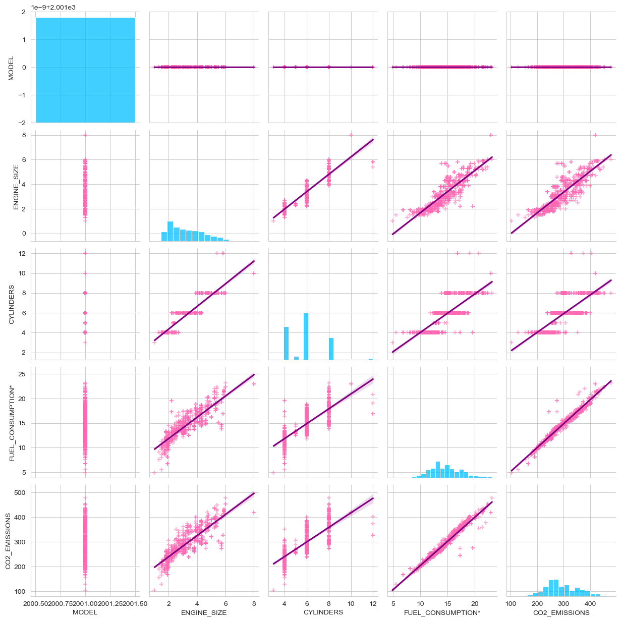
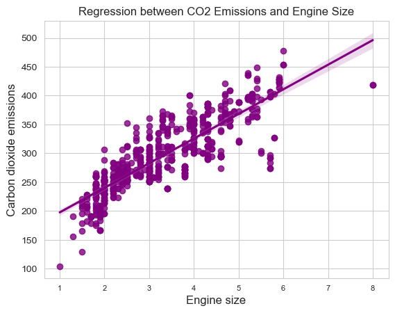
It is evident that the "CO2_EMISSIONS" column is linearly connected with the "ENGINE_SIZE", "CYLINDERS", and "FUEL_CONSUMPTION*" columns; hence, we will plot their correlation plots individually to examine them on a larger scale.
sns.set_style("whitegrid")

sns.regplot(df,
	    x="ENGINE_SIZE",
	    y="CO2_EMISSIONS",
	    color="purple")

plt.xlabel("Engine size", fontsize=12, loc="center")
plt.ylabel("Carbon dioxide emissions",
	    fontsize=12,
	    loc="center")
plt.xticks(fontsize=8)
plt.yticks(fontsize=10)
plt.show()
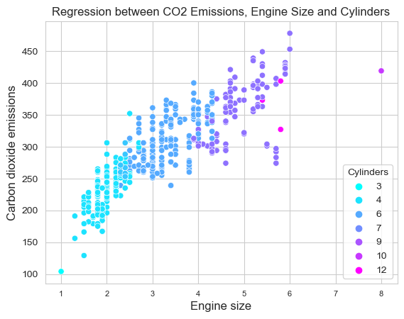
sns.set_style("whitegrid")

sns.scatterplot(df,
		  x="ENGINE_SIZE",
		  y="CO2_EMISSIONS",
		  hue="CYLINDERS",
		  palette="cool",
		  sizes=(4,8))
plt.xlabel("Engine size", fontsize=12, loc="center")

plt.ylabel("Carbon dioxide emissions",
	   fontsize=12, loc="center")
plt.xticks(fontsize=8)
plt.yticks(fontsize=10)
plt.legend(title='Cylinders', loc='lower right')
plt.show()
sns.set_style("whitegrid")

sns.scatterplot(df, x="FUEL_CONSUMPTION*",
		  y="CO2_EMISSIONS",
		  color="purple")
plt.xlabel("Fuel consumption",
	    fontsize=12, loc="center")
plt.ylabel("Carbon dioxide emissions",
	    fontsize=12, loc="center")
plt.title('Regression between CO2 Emissions
	    and Fuel Consumption')
plt.xticks(fontsize=8)
plt.yticks(fontsize=10)
plt.show()
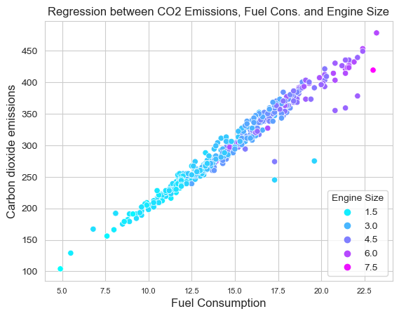
sns.set_style("whitegrid")

sns.scatterplot(df, x="FUEL_CONSUMPTION*",
		  y="CO2_EMISSIONS", hue="ENGINE_SIZE",
		  palette="cool", sizes=(4,8))
plt.xlabel("Fuel Consumption", fontsize=12, loc="center")
plt.ylabel("Carbon dioxide emissions",
	   fontsize=12, loc="center")
plt.title('Regression between CO2 Emissions,
	   Fuel Consumption and Engine Size')
plt.xticks(fontsize=8)
plt.yticks(fontsize=10)
plt.legend(title='Engine Size', loc='lower right')
plt.show()
The visualization stage has concluded the exploratory analysis. Before processing feature engineering, we have sufficient data to finalize the dataset for training the ANN algorithm.
Feature EngineeringWe will begin by defining a new dataframe including the attributes that are correlated with CO2 emissions.
features=df[["VEHICLE CLASS", "ENGINE_SIZE", "CYLINDERS", "TRANSMISSION", "FUEL", "FUEL_CONSUMPTION*"]]
features.head(10)
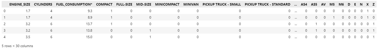
Next, we will utilize one-hot encoding to convert object-typed features to binary format. The original columns should be dropped from the dataframe.
features_one_hot = features

features_one_hot = pd.concat([features_one_hot, pd.get_dummies(features['VEHICLE CLASS'])],axis=1)
features_one_hot.drop(['VEHICLE CLASS'], axis = 1, inplace = True)

features_one_hot = pd.concat([features_one_hot, pd.get_dummies(features['TRANSMISSION'])],axis=1)
features_one_hot.drop(['TRANSMISSION'], axis = 1, inplace = True)

features_one_hot = pd.concat([features_one_hot, pd.get_dummies(features['FUEL'])],axis=1)
features_one_hot.drop(['FUEL'], axis = 1, inplace = True)

features_one_hot.head()
If desired, we can evaluate the correlation between one-hot encoded attributes and other features by printing the correlation table of all the data using the.corr() method on the new dataset.
features_one_hot.corr()
Next, we will convert the attributes of the dataset into float, and then again into numpy format with the data type float32, since the default data type of numpy arrays is float64, in order to reduce memory by half and increase processing performance by twofold.
X = features_one_hot.astype(float)
X = np.array(X).astype('float32')
We apply the same transformation to the target variable and reshape it into a one-dimensional array.
Y = df['CO2_EMISSIONS'].to_numpy().astype('float32')
Y = Y.reshape(-1,1)   # we reshape it to make it 1 by 1 dimension
type(Y)
To employ dataframes, their attributes must be standardized such that they all contribute equally to the predictions.
transform = preprocessing.StandardScaler()
X = transform.fit_transform(X)
Y = transform.fit_transform(Y)
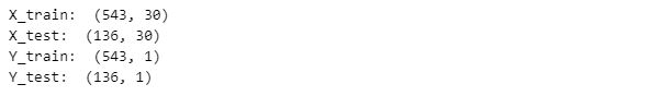
After that, we split the X and Y data into training and test sets with the use of the train test split function. In order to use 20% of the data as a test dataset and achieve the same results as when using random state 5, we set the parameters test size to 0.2 and random state to 2. The total number of samples is displayed separately for each data collection.
X_train, X_test, Y_train, Y_test=train_test_split(X, Y, test_size=0.2, random_state=5)
print("X_train: ", X_train.shape)
print("X_test: ", X_test.shape)
print("Y_train: ", Y_train.shape)
print("Y_test: ", Y_test.shape)
We finally have a structured dataset to construct, train, test and evaluate an artificial neural network to predict vehicle CO2 emissions.
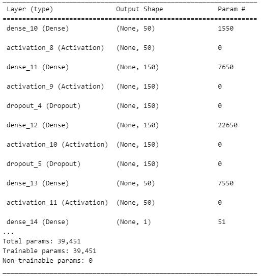
Building and Training the Neural Network ModelTo begin with, we create a Keras sequential object. After that, we configured an input dense layer with 50 neurons and an input dimension of 30, given that our training dataset consists of 30 features. The activation function defined for the input layer is "Relu" because we are attempting to predict a continuous variable using a regression purpose, and the predicted values must be greater than zero. Therefore, "Relu" is one of the most useful activation functions for our model, and it is the optimal choice to make our predictions greater than zero.
Subsequently, the first hidden dense layer with 150 neurons and the "Relu" activation layer were defined.
Because some layers tend to acquire co-dependency after training, we then set a dropout with value as 0.5 to randomly eliminate half of the neurons in the layer along with their weights. This enhances the neural network's ability to generalize.
The second hidden layer was then defined using 150 neurons and the activation function "Relu."
After the second hidden layer, we set a dropout with a value of 0.5 to eliminate another 50 percent of neurons and their weights.
Then, we defined the third hidden dense layer with 50 neurons, and the activation layer is defined as "linear" because we are attempting to predict one continuous variable.
We defined a single-neuron layer as the output layer.
Finally, we defined the network loss metric as mse (mean squared error) and the optimizer as "Adam."
ANN_model = keras.Sequential()
ANN_model.add(Dense(50, input_dim = 30))  # input layer of neural network with 50 neurons, and their dimensions equal to 9 because it has to be same with the column number in the training input data
ANN_model.add(Activation('relu')) # we defined the activation function of first layer
ANN_model.add(Dense(150)) # we added an hidden layer with 150 neurons
ANN_model.add(Activation('relu'))  # we defined the activation function of the first hidden layer
ANN_model.add(Dropout(0.5))  # After training, some of the layers starts to develop co-dependency, so we need to drop randomly the half of the neurons in the layer together with their weights to improve the performance of generalization of network
ANN_model.add(Dense(150))  # we added second hidden layer with 150 neurons
ANN_model.add(Activation('relu'))  # we defined the activation function of the second hidden layer
ANN_model.add(Dropout(0.5))
ANN_model.add(Dense(50))   # we added third hidden layer with 50 neurons
ANN_model.add(Activation('linear'))  # we defined the activation function for third layer
ANN_model.add(Dense(1))   # we added output layer with 1 neuron
ANN_model.compile(loss = 'mse', optimizer = 'adam')  # the loss metric defined as mse, and optimizer defined as adam optimizer
ANN_model.summary()
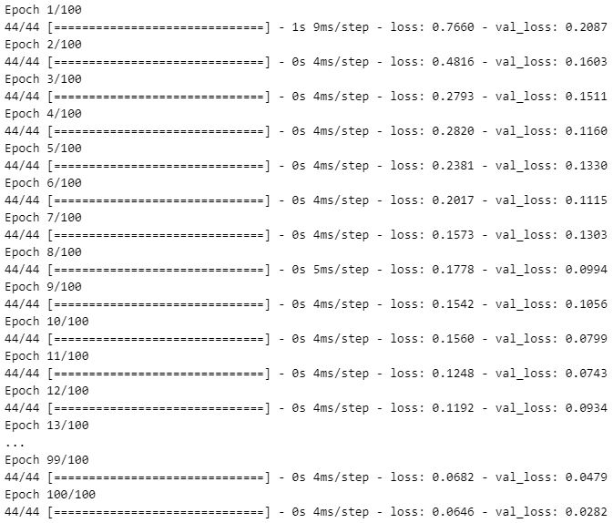
After compiling the ANN, it is necessary to train our model with training datasets. To prevent overfitting, we defined epoch (iteration) as 100 and batch size as 10. In addition, we assigned the fitting model to an object variable so that his history could be stored for performance evaluation.
epochs_hist=ANN_model.fit(X_train, Y_train, epochs=100, batch_size=10, validation_split=0.2)
Before making predictions, we can evaluate the accuracy of our model using test datasets.
result = ANN_model.evaluate(X_test, Y_test)
accuracy_ANN = 1 - result
print("Accuracy : {}".format(accuracy_ANN))

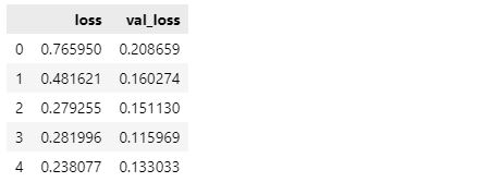
The ANN model exhibits approximately 95% accuracy on test data. Using the epochs hist object that we defined during model fitting, we can also compare the training loss and validation loss results.
ann_loss=pd.DataFrame(epochs_hist.history)
ann_loss.head(5)
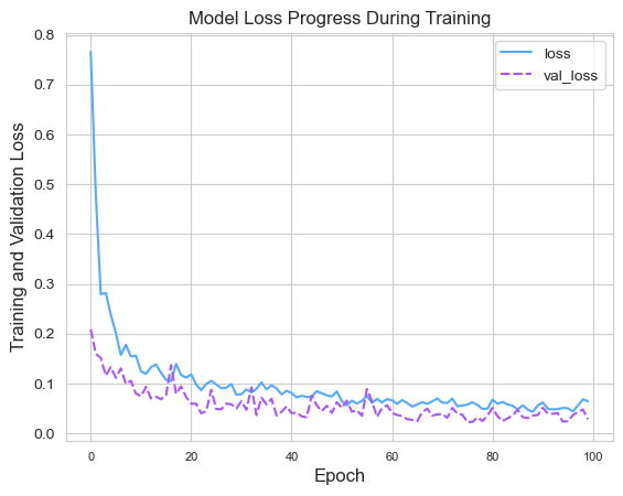
The comparison of loss values can be seen by superimposing their line graphs.
sns.set_style("whitegrid")

sns.lineplot(data=ann_loss[['loss', 'val_loss']],
	     palette="cool")

plt.title('Model Loss Progress During Training')

plt.xlabel('Epoch', fontsize=12, loc="center")
plt.ylabel('Training and Validation Loss',
	   fontsize=12, loc="center")

plt.legend()
plt.xticks(fontsize=8)
plt.yticks(fontsize=10)
plt.show()
We may now evaluate our model based on its predictions. Before, predictions are created using the X _test data set.
Y_predict = ANN_model.predict(X_test)

predictions_df = pd.DataFrame(np.ravel(Y_predict),columns=["Predictions"])
comparison_df = pd.concat([pd.DataFrame(Y_test,columns=["Actual Values"]), predictions_df],axis=1)
comparison_df

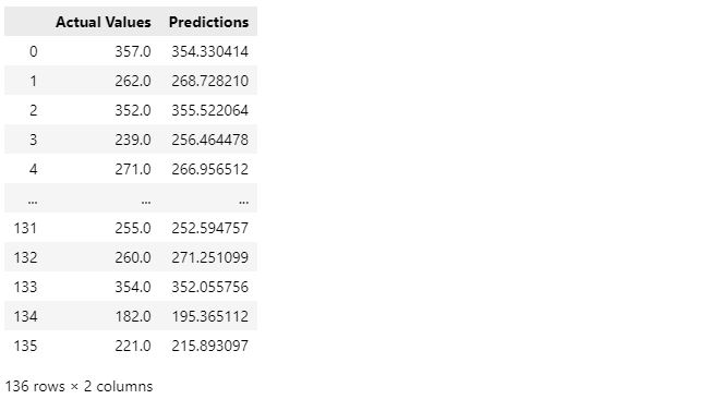
Then, we can use the .tansform.inverse_transform() function to reverse the scaling of the test and prediction values in order to compare their real values.
Y_test_orig = transform.inverse_transform(Y_test)
Y_predict_orig = transform.inverse_transform(Y_predict)

predictions_orig_df = pd.DataFrame(np.ravel(Y_predict_orig),columns=["Predictions"])
comparison_orig_df = pd.concat([pd.DataFrame(Y_test_orig,columns=["Actual Values"]), predictions_orig_df],axis=1)
comparison_orig_df
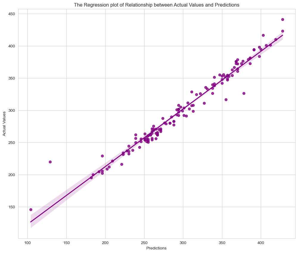
We can check how accurate the model is by using visualization methods on actual and predicted values that have been rescaled.
The correlation between actual and predicted values is depicted in the regression graph shown above. The model appears to be operating properly.
sns.set_style("whitegrid")

plt.figure(figsize=(12,10))
sns.regplot(data=comparison_orig_df, x=comparison_orig_df["Actual Values"], y=comparison_orig_df["Predictions"], color="purple")
plt.title("The Regression plot of Relationship between Actual Values and Predictions")
plt.xlabel("Predictions")
plt.ylabel("Actual Values")
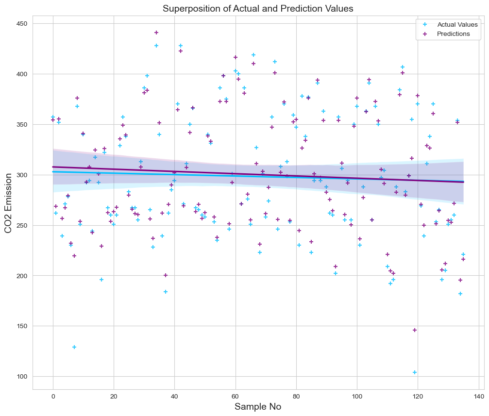
We employed a regression plot to depict the superposition of actual and projected values. We defined the x axis as the number of samples and the y axis as the predicted and actual CO2 emission levels. We can monitor the variation between values and alter their residual deviations.
fig = plt.figure(figsize=(12, 10))
sns.regplot(x=pd.DataFrame([range(0,136)]), y=comparison_orig_df["Actual Values"], color='deepskyblue', marker='+', label="Actual Values")
sns.regplot(x=pd.DataFrame([range(0,136)]), y=comparison_orig_df["Predictions"], color="purple", marker='+', label="Predictions")

plt.title('Superposition of Actual and Prediction Values', size=14)
plt.xlabel('Sample No', size=14)
plt.ylabel('CO2 Emission', size=14)
plt.legend()
plt.show()
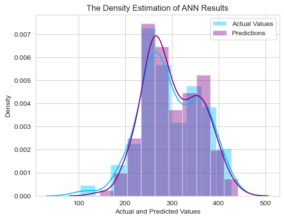
Lastly, we used a distribution plot to illustrate the intersection between real and predicted values.
sns.set_style("whitegrid")

plt.figure(figsize=(12,10))
fig, ax = plt.subplots()
sns.distplot(comparison_orig_df["Actual Values"], color="deepskyblue", label="Actual Values", ax=ax, bins=10)
sns.distplot(comparison_orig_df["Predictions"], color="purple", label="Predictions", ax=ax, bins=10)

plt.title("The Density Estimate of ANN Results")
plt.xlabel("Actual and Predicted Values")
plt.ylabel("Density")
plt.legend()
plt.show()
After the conclusion of evaluation of ANN model, we can verify the result my using error metrics.
MSE = mean_squared_error(Y_test_orig, Y_predict_orig)
MAE = mean_absolute_error(Y_test_orig, Y_predict_orig)
r2 = r2_score(Y_test_orig, Y_predict_orig)

print('MSE =',MSE, '\nMAE =',MAE, '\nR2 =', r2)
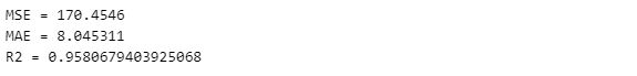
The R2 (R-squared error) score indicates that our model can estimate CO2 emissions from vehicles with around 96% accuracy.